
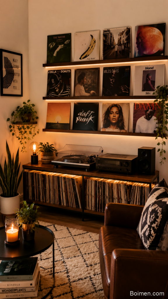
I used to think a gallery wall was something only people with perfect taste and unlimited budgets could pull off. Then I spent four months staring at a blank wall above our secondhand couch, moving three crooked frames around like a puzzle I couldn’t solve. What finally worked wasn’t a designer’s formula. It was a pile of small, repeatable decisions — spacing, scale, and honestly, giving myself permission to hang things wrong and rehang them later. This list is everything I learned, plus the layout tricks and cozy furniture pairings that make a gallery wall feel lived-in instead of staged. Take one idea, try it this week, and don’t wait for the perfect wall.
Advertisements1
Table of Contents(Click to Toggle)
- Why a Gallery Wall Makes a Room Feel Cozy
- 16 Cozy Living Room Gallery Wall Ideas
- 1. The Anchor Piece Method
- 2. The 2-Inch Spacing Rule
- 3. The 57-Inch Center Line
- 4. The Paper Template Trick
- 5. The Grid Layout
- 6. The Salon-Style Cluster
- 7. The Stair-Step Layout
- 8. The Mixed-Media Wall
- 9. The Oversized Single Frame
- 10. The Floating Shelf Frame Ledge
- 11. The Warm Lighting Layer
- 12. The Plush Seating Pairing
- 13. The Cozy Textile Overlap
- 14. The Consistent Frame Finish
- 15. The Personal Photo Mix
- 16. The Rotate-and-Refresh Habit
- Bonus: The Rental-Safe Hanging Kit
- Bonus: The Color Palette Swatch Test
- Bonus: The Thrifted Frame Swap
- Bonus: The Kids’ Art Rotation
- The Cozy Wall You’ll Actually Keep
Why a Gallery Wall Makes a Room Feel Cozy
A gallery wall does something furniture can’t: it gives a room a voice. Blank walls make even a comfortable couch feel temporary, like you’re still moving in. Once you layer art, photos, and a few textures across a wall, the room starts to feel finished — and finished rooms are the ones you actually relax in.
There’s a practical side too. Gallery walls let you use small pieces you already own instead of buying one expensive statement artwork. They cover awkward wall shapes, add visual warmth above seating, and they’re forgiving. If one frame is slightly off, the whole arrangement still reads as intentional. That forgiveness is why I recommend starting here if you’re nervous about decorating.
16 Cozy Living Room Gallery Wall Ideas
1. Pinterest : The Endless Gallery Wall Idea Board
What it is: A visual search platform where you can collect gallery wall layouts, spacing diagrams, and cozy living room photos into one board before you buy a single frame.
Category: Inspiration and planning
Why it stands out: You can search “gallery wall layout small living room” and get hundreds of real rooms instead of showroom setups. Save ten pins, notice which layouts repeat, and you’ll spot your own taste fast.
Best for: Anyone who needs to see options before committing to a layout.
2. The Anchor Piece Method : Start With One Large Frame
What it is: Choosing a single large piece — usually 24 by 36 inches or bigger — and building the rest of the wall around it.
Category: Layout strategy
Why it stands out: It solves the hardest decision first. Once the anchor is centered, smaller frames fill in around it, and the wall stops feeling random. In my living room, one oversized botanical print made the other seven frames look deliberate.
Best for: Walls above a couch where you need a clear focal point.
3. The 2-Inch Spacing Rule : Keep Gaps Consistent
What it is: Standardizing the space between frames to roughly two inches, so the arrangement reads as one unit.
Category: Spacing technique
Why it stands out: Inconsistent gaps are the number one reason gallery walls look messy. Two inches is tight enough to feel connected but loose enough that frames don’t crowd each other. For very large frames, stretch to three inches.
Best for: First-timers who want a rule they can actually follow.
4. The 57-Inch Center Line : Hang at Eye Level
What it is: Placing the center of your gallery arrangement about 57 inches from the floor — museum height.
Category: Placement standard
Why it stands out: Most people hang art too high. When the center sits at eye level, the wall relates to the furniture below it instead of floating near the ceiling. If your couch is tall, nudge the center up a few inches.
Best for: Rooms where the wall feels disconnected from the seating.
5. The Paper Template Trick : Plan Before You Drill
What it is: Cutting paper to the size of each frame, taping the shapes to the wall, and rearranging until the layout works.
Category: Preparation method
Why it stands out: It costs nothing and saves a wall full of holes. I taped paper squares up for a week and moved them every time I walked past. By day five, the layout was obvious.
Best for: Renters and anyone who hates patching nail holes.
6. The Grid Layout : Symmetry Without Stress
What it is: Frames arranged in even rows and columns, all the same size or in a repeating pattern.
Category: Layout style
Why it stands out: Grids look intentional even when the art inside is mismatched. A three-by-three grid of same-size frames is the safest cozy wall you can build, and it pairs beautifully with a simple sofa.
Best for: Small walls and people who like order.
7. The Salon-Style Cluster : Fill the Wall Edge to Edge
What it is: A dense arrangement of many frames of different sizes, covering most of the wall surface.
Category: Layout style
Why it stands out: It’s the warmest option for large empty walls. The trick is keeping gaps consistent even as sizes vary, and mixing one or two round or oval frames to break up the rectangles.
Best for: Tall walls behind a sectional or open shelving.
8. The Stair-Step Layout : Follow the Furniture Line
What it is: Arranging frames in a diagonal that echoes a staircase, sloped ceiling, or the arm of a sectional.
Category: Layout style
Why it stands out: It turns an awkward wall into a feature. The diagonal creates movement, so your eye travels across the room instead of stopping at one spot.
Best for: Walls beside stairs or under slanted ceilings.
9. The Mixed-Media Wall : Add Texture Beyond Paper
What it is: Combining framed art with woven baskets, small mirrors, and fabric pieces in the same arrangement.
Category: Texture and materials
Why it stands out: Texture is what makes a wall feel plush instead of flat. A round woven basket between two frames adds warmth and softens the hard edges of glass and metal.
Best for: Rooms that feel a little cold or echoey.
10. The Oversized Single Frame : One Statement, Zero Clutter
What it is: A single large piece — a print, map, or textile — hung alone above the seating.
Category: Minimalist approach
Why it stands out: It delivers the gallery wall feeling with one nail. Wide mats make even modest prints look expensive, and there’s nothing to align.
Best for: Small living rooms and low-effort makeovers.
11. The Floating Shelf Frame Ledge : Swap Art Without Nails
What it is: A shallow picture ledge where frames lean instead of hang.
Category: Display furniture
Why it stands out: You can rearrange art in minutes. Layer a large frame behind two smaller ones for depth, and rotate pieces with the seasons.
Best for: Renters and anyone who changes their mind often.
12. The Warm Lighting Layer : Light the Wall, Not the Ceiling
What it is: Adding a picture light, a plug-in wall sconce, or a floor lamp aimed at the gallery.
Category: Lighting
Why it stands out: Warm light at 2700K makes art glow and makes the whole corner feel like evening. A single picture light above the anchor frame can transform a plain wall.
Best for: Rooms that only have harsh overhead lighting.
13. The Plush Seating Pairing : Ground the Wall With Comfort
What it is: Pairing the gallery wall with a deep-seated sofa, a boucle accent chair, or an ottoman in a soft fabric.
Category: Furniture pairing
Why it stands out: Art above a hard bench feels like a waiting room. Art above a sink-in couch feels like home. Match the wall’s visual weight with furniture you actually want to sit on.
Best for: Making a gallery wall feel intentional, not decorative.
14. The Cozy Textile Overlap : Let Fabric Touch the Frames
What it is: Positioning curtains, a throw draped over the couch arm, or a tall plant so it slightly overlaps the bottom of the gallery.
Category: Styling detail
Why it stands out: A little overlap makes the wall look collected over time rather than installed in one afternoon. Keep it to one or two elements so the art stays visible.
Best for: Walls that look too perfect and need softening.
15. The Consistent Frame Finish : One Color, Many Sizes
What it is: Using the same frame color — usually black, natural wood, or brass — across every piece, while varying sizes.
Category: Framing strategy
Why it stands out: Consistency in frames lets the artwork do the talking, and it makes mismatched prints look like a collection. Spray-painting thrifted frames one color is the cheapest version of this trick.
Best for: Mixing photos, prints, and kids’ art on one wall.
16. The Personal Photo Mix : Blend Memories With Art
What it is: Interspersing family photos, travel snapshots, and ticket stubs among purchased prints.
Category: Personalization
Why it stands out: This is what makes guests stop and look. Keep photos in the same frame finish as the art so the wall stays cohesive, and limit yourself to a handful so it doesn’t become a photo collage.
Best for: Making a gallery wall that tells your story.
Bonus: The Rental-Safe Hanging Kit
What it is: Damage-free adhesive strips and small hooks rated for frame weight.
Category: Tools
Why it stands out: Modern adhesive hooks hold surprisingly well on painted walls and remove cleanly when you follow the directions.
Best for: Apartments and dorms.
Bonus: The Color Palette Swatch Test
What it is: Taping paint swatches or fabric scraps next to your frames to check the palette.
Category: Color planning
Why it stands out: It catches clashing tones before you buy more art.
Best for: Anyone building a wall around one bold print.
Bonus: The Thrifted Frame Swap
What it is: Buying cheap secondhand frames and replacing the art inside.
Category: Budget sourcing
Why it stands out: Solid wood frames cost a fraction of new ones, and a coat of paint unifies them.
Best for: Filling a large salon-style wall on a budget.
Bonus: The Kids’ Art Rotation
What it is: A dedicated frame or two where children’s drawings get swapped out monthly.
Category: Family-friendly decor
Why it stands out: It keeps the wall personal without letting paper pile up on the fridge.
Best for: Family living rooms.
The Cozy Wall You’ll Actually Keep
Here’s what I’ve learned after three gallery walls and one very patient partner: the wall that works is the one you’re willing to adjust. Start with paper templates, pick one anchor piece, keep your gaps even, and let the rest evolve. Progress over perfection, every time.
Try this week: Tape paper outlines for five frames on your wall and live with the layout for three days before you nail anything. Move one piece each day and notice how the room feels.
What’s the one piece you’ve been meaning to hang? Tell me in the comments — I read every one, and I’m always looking for the next idea to steal.
Here’s to small steps, big impact.

Maya writes about sustainable living and zero-waste swaps for everyday families. She focuses on small, budget-friendly changes that actually stick, tested in her own chaotic kitchen.


Leave a Comment